Maintaining Accessibility in a Responsive World
At Filament Group, our primary concern has long been to build sites that are accessible to as many people as possible. In that aim, being “accessible” means many things. It means that a page must load quickly—even in slow and spotty mobile networks. After loading, the page should be usable and feel appropriate and intuitive to folks using any device, browser, viewport size, and assistive technology. More often than not, the practices we use to achieve these goals play nicely together, but sometimes one optimization can complicate another. When that happens, we try to step back and find ways to satisfy all our priorities.
Disconnected interfaces
Permalink to 'Disconnected interfaces'One such complication we’ve encountered is in accurately communicating to assistive technology (e.g. screen readers) the hierarchy and state of a responsive layout. CSS media queries enable us to adapt the way our HTML is presented visually depending on viewport size, but doing that can result in a disconnect between the markup that keyboard and assistive technology users interact with, and the way that markup is being presented on the screen.
That disconnect can create usability barriers for many people. Our field typically discusses screen reader usage as it relates to blind users, and those are certainly common and critical use cases. But it’s easy to forget that folks use screen readers and other assistive tech (AT) for a far wider variety of additional reasons, from partial sightedness to cognitive disabilities, to all kinds of physical impairment (temporary and not).
Identifying the particulars
Permalink to 'Identifying the particulars'Some related issues surfaced for us during a recent accessibility audit of a large-scale site we’d built. Initial rounds of screen reader testing seemed to go well, and that pleased us as we’d taken the time to use semantic, well-organized markup and even use ARIA attributes when necessary. In later rounds of testing though, sighted testers used a widescreen display in combination with a screen reader and ran into some problems:
- Spatial & Behavioral Cues: cues in our markup that were designed to aid usability were inapplicable in some usage contexts (“navigate using your arrow keys”) or viewport sizes (“the example above demonstrates…”)
- Accessible hiding: Visibly hidden content could sometimes contain focusable elements (e.g. anchors) that were still hidden when they received focus.
- Content Toggles: Some collapsible content toggles would communicate a collapsed state to AT, even when at some viewport sizes their content was statically displayed in the visual layout. Similarly, some modal dialog content was displayed inline in the page at wider CSS breakpoints, yet the ARIA role and state attributes on the markup still conveyed that it was a hidden dialog, rendering it invisible to AT.
- Focus Order: The order in which elements received focus while tabbing through the page was sometimes inconsistent with the order those elements were visually displayed.
These issues presented a need to better communicate the role and state of the interface at every breakpoint. In some cases, we were able to find maintainable solutions, while sometimes we had to settle on a pragmatic compromise. Here’s where we landed.
Spatial & Behavioral Cues
The issues that related to spatial and behavioral cues were quickest to fix. In each case, we strived to find a useful way to describe how to use a component without describing too much of the particulars of the visual UI or how it should be used by any particular input mode.
Some examples:
- For a text caption that might appear below or to the right of an image depending on the viewport, we’d avoid referencing the image with terms like “above” or “left” and instead say something like “Pictured: …”
- For an autosuggest search field that said, “use your arrow keys to browse the suggestions,” we would instead say, “As you type, relevant search suggestions will automatically appear after this field.” And then, we took additional care to make sure that the control was intuitive to use with many common means of navigation (arrow keys, tab key, etc.) so that usage instructions weren’t necessary anyway.
Accessible hiding
The practice of “accessible” hiding aims to hide visually-unnecessary portions of page content from sighted users while retaining their visibility to assistive tech. One common way to do that is to hide an element outside of the visual viewport without using styles like display: none, which would make the content invisible to all users (AT too!). For example:
.accessible-hidden {
  position: absolute;
  top: 0;
  left: -999px;
  height: 1px;
  width: 1px;
  clip: rect(1px, 1px, 1px, 1px);
  white-space: nowrap;
}
One thing that’s easy to forget is that hiding content in this way does not prevent focusable content from receiving keyboard focus, and when the roving focus state seems to disappear off the page it can be very disorienting. To avoid this, we try to remember that any accessibly-hidden content should be visible when it gains focus. For example, this CSS would place a focused element at the top of the viewport:
.accessible-hidden:focus {
  position: fixed;
  top: 0;
  left: 0;
  background: #fff;
  padding: 10px;
  etc etc...
}
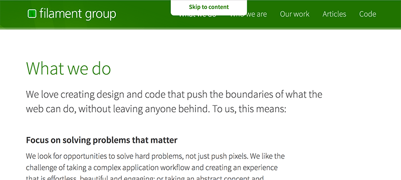
One example of this behavior can be found on the interior pages of Filament’s site, all of which have a skip-to-content link that is hidden when not focused. If you’re tabbing through this page, it’ll be the first element that gains focus, shown top/center. Here’s how it looks:

I should note that this pattern of showing hidden content when focused is not our idea, but it’s a good technique to remember. Generally, we recommend trying to avoid hiding focusable elements from any users, but we use this approach in cases where it makes sense.
Content Toggles
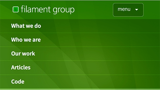
A larger challenge for us came in accurately communicating the role and state of responsive content toggles. Consider a component like this one, where on small screens, our navigation is only seen after tapping on a button to expand it:

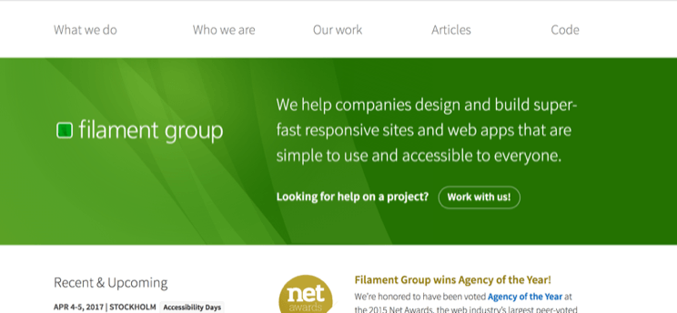
…yet in wider viewports, the navigation is automatically expanded and the button is no longer needed:

While the difference in these two presentations should be intuitive to sighted users, the markup that we were using to describe this control only adequately described the interactive, collapsible version of the component. This meant that screen reader users with larger displays would end up with an audible experience that didn’t match the presentation on the screen. To address this, we knew we had to do more to sync the component’s behavior with its markup.
Coding a “sometimes-collapsible”
Permalink to 'Coding a “sometimes-collapsible”'When a collapsible toggle like this is in its user-interactive mode, we can toggle the its content using CSS display: none or display: block. By pairing that with some JavaScript, we can enable the user to toggle that style when they click the toggle button. In our case, the toggle “button” starts out as an HTML heading element (h2), so that it makes sense in the page hierarchy before it has toggle behavior. Once the JavaScript behavior is applied however, we need to convey to assistive tech that the heading is now offering the toggle button behavior, so it needs some different markup in that situation. Here’s the HTML implementation we ended up using for the interactive version of the component:
<h2 class="collapsible_header">
  <button aria-haspopup="true" aria-controls="packinglist" aria-expanded="false">Packing List
  </button>
</h2>
<div class="collapsible_content" role="menu" aria-hidden="true" id="packinglist">
  ...
</div>
…and when toggled open:
<h2 class="collapsible_header collapsible-expanded">
  <button aria-haspopup="true" aria-controls="packinglist" aria-expanded="true">Packing List
  </button>
</h2>
<div class="collapsible_content" role="menu" aria-hidden="false" id="packinglist">
  ...
</div>
Note: This implementation can vary and it could be simpler for some cases. We found this configuration to test well in our audit, particularly because we were using this toggle pattern both for simple one-off toggles and for more complicated nested navigation menus. Also, we had originally wanted to change the h2 itself into a button by adding role="button", thinking that it had little value as a heading once it becomes interactive, but ARIA rule #2 states we shouldn’t do that, so we added a child button and we still feel conflicted about it.
So that HTML makes the interactive toggle meaningful to assistive tech. But at viewport sizes where the collapsible content is always-displayed and not user-interactive, we’ll want to either hide the h2 from everyone, or remove the button element and keep the h2 as a regular static heading (in a typical site, we’ll often have several components that use each of these behaviors). Also at that wider viewport size, we will need to ensure that the content div is visible to all users, since there’s no longer any toggle functionality. To do that, we need to use JavaScript to remove and apply some attributes as they are needed.
One way to apply that JavaScript would be to look at the viewport’s size and manipulate the HTML attributes depending on the conditions that applied to the layout of each component. Of course, we knew we wanted to keep information about particular breakpoint sizes out of our JavaScript (and solely in the CSS), so we decided to set up our JavaScript to keep track of CSS properties that we knew would imply that the collapsible was interactive or not. On our collapsible header, we explicitly set the CSS cursor property to either pointer or default, depending on whether it’s interactive or not, respectively.
In code, here’s the CSS for that:
/* interactive heading/button */
.collapsible_header {
  cursor: pointer;
}
/* hide the content div if it comes after a collapsed heading */
.collapsible_content {
  display: none;
}
.collapsible-expanded + .collapsible_content {
  display: block;
}

@media (min-width: 700px){
  /* change cursor on heading/button to default, designating it non-interactive */
  .collapsible_header {
    cursor: default;
    /* optional: hide the heading with display: none; here */
  }
  .collapsible_content {
    display: block;
  }
}
And in our JavaScript, we used a resize handler to run a function that checks this CSS property’s value. If the value was pointer, we knew the CSS was currently presenting the toggle as user-interactive, and it needed to have the appropriate attributes paired with that behavior. If the value was default, the script would deem it to be non-interactive and the attributes would need to be removed. Here’s how that would look in JavaScript (pseudocode for example purposes):
window.addEventListener( "resize", function(){
  // assume for example purpses that 'myHeader' references a collapsible header...
  if( window.getComputedStyle( myHeader, null ).getPropertyValue( "cursor" ) === "default" ){
    // remove the role, aria, and tabindex attributes from the heading and div
    removeAttributes();
  }
  else {
    // add the role, aria, and tabindex attributes from the heading and div
    addAttributes();
  }
});
This approach worked well for our toggle components, and since we happen to use this “collapsible” control for a large number of features throughout the site, the change had a large impact on improving the accessibility of the site as a whole.
Toggling dialog role & state
Permalink to 'Toggling dialog role & state'Similar to the content toggles, we also sometimes use modal dialog controls for informational (or functional) content may be displayed inline in the page layout at certain viewport sizes. In other words, in a small viewport, users might see a link that opens some content in a modal dialog, while at wider breakpoints they might see that dialog’s content displayed in the side column of the page. A couple of cases where this modal/inline pattern has made sense for us are a user sign-in/signup form, and the list of faceted filters that pair with a search result page.
The HTML for an accessible dialog component requires its own set of attributes, such as a role="dialog" attribute on its container element, but we were able to use the same CSS listening pattern from the collapsible toggle to transition between the interactive or static role of the dialog. For the dialog, we deemed it the control “non-interactive” if the dialog element satisfied 2 conditions: 1) the dialog element was visible to all users (i.e. not display: none or visibility: hidden) and, 2) the dialog offered no visible means of user dismissal (i.e. if its “close” button was not visible to all users).
Notably, at breakpoints where the dialog content was visible in the page, the link that formerly opened the dialog became a simple anchor link that would, upon clicking it, scroll to (and jump focus to) the element that was formerly a dialog. Neat!
Custom CSS properties instead?
Permalink to 'Custom CSS properties instead?'A more clever approach to this same problem was sent to us by Michael Scharnagl. Michael’s article, Handling states on resize using CSS custom properties, demonstrates how to use custom CSS properties to pass information to JavaScript, such as the expanded or collapsed state of a component. What’s nice about Michael’s approach is that it removes the need for the JavaScript to know any particulars about the styles involved in the component’s presentation (which as he notes, could also be said of an older, slightly hackier technique (his words not mine!) that uses CSS pseudo-content to pass information to JavaScript).
As support for CSS custom properties continues to improve, we will consider using Michael’s approach ourselves.
Focus order
Last on the problem checklist above is the order in which focus will rove around a layout at different breakpoints. The problem in this case that while CSS allows us to responsively reflow between vastly different positioned/floated/flexboxed layouts across viewport sizes, the keyboard focus order (and indeed, the content reading order for screen readers) follows the order of the elements in the page source. Some screen reader software, like VoiceOver, highlights the text it is currently reading, which does help, but only as much as a visible focus state otherwise would. As you might imagine, when this communicated order jumps around in an order that doesn’t closely match a left-right-top-bottom visual interface, it can be quite disorienting, particularly for those who use screen readers as an aid to the visual layout.
Many accessibility advocates, and also the w3c, recommend that designers not stray from source order when creating a CSS layout, which would indeed avoid this issue entirely. Of course, the majority of layouts we see on the web do not strictly follow HTML source order, and for good reason: across viewport sizes, the usability of a design can be dramatically improved by shifting the visual hierarchy, scale, and order of the elements in a page. Indeed, the great promise of CSS was to free us from the constraints of binding our HTML to any particular visual presentation.
No great solutions…
Permalink to 'No great solutions…'It seems this problem is only going to get worse now that advanced CSS layout is widely supported, and it certainly doesn’t help that we now responsively toggle between many of these advanced layouts depending on viewport size. Unfortunately, the tools we have as web developers seem to be inadequate for addressing this issue properly. Given the choices of A) dynamically adapting our HTML source order for every breakpoint, B) sending different HTML sources to each client, or C) renumbering the tabindex attributes of all focusable elements to match their rendered order, we emphatically choose option D) “Nope”.
For our client’s particular tab order issues, we weren’t able to do much to improve the tab order in some of our layouts, but we did add some navigational cues within the markup to help mitigate the problem. For example, when we had a two column layout which at some breakpoints, had a left column that came after the right column in source order, we sometimes used an anchor at the top of the first content in the source that linked to the subsequent content. More importantly though, the use of ARIA landmark roles seemed to aid in orientation here, as screen readers provide their own methods for navigating between landmarks.
Whose job is this?
Permalink to 'Whose job is this?'Seemingly, this issue should be addressed at the browser implementation level rather than leaving it to developers to work out. Wouldn’t it be nice if the browser just figured out an appropriate tab order for a given layout? Relatedly, during the time we were testing our client’s site, we were encouraged to find that Firefox had implemented flexbox so that tab focus order would indeed follow the order that the elements were rendered visually in the page. This seemed like the right solution to a problem that’s just too big for web authors to address. Unfortunately, Mozilla since deemed that behavior to be a bug and “fixed” it, so it now works like all other browsers we know of.
In Flexbox & the keyboard navigation disconnect, Léonie Watson writes:
CSS Flexbox can create a disconnect between the DOM order and visual presentation of content, causing keyboard navigation to break. For this reason, the CSS Flexible Box Layout module warns against resequencing content logic, but asking authors not to use flexbox in this way seems illogical in itself. TLDR: The only viable way (in my opinion) for the flexbox disconnect to be resolved, is in the browser (as with the Firefox “bug”) and the accessibility tree.
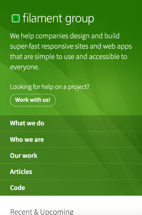
While admitting our limited understanding of all the concerns, we’d tend to agree. It would be great to see focus order match the visually rendered order, and not just for flexbox, but with all CSS layout (float, position, etc.). Examples abound. Filament Group’s site is fairly linear in most of our pages, but our homepage’s presentation flips some of its content vertically (not just horizontally) at different viewport sizes:
Homepage, small viewport:

Homepage, large viewport:

We think the wider screen layout of our homepage is better with that shift, but the tab order is indeed a little wacky as a result.
How about you?
Permalink to 'How about you?'Thanks for reading! I’ve covered some of the issues we’ve recently run into at the intesection of responsive design and accessibility, but we’re sure there are many more to consider. Have you encountered any issues similar to these? I’m researching a talk about this and would love to hear what you’ve found. Please write to us on Twitter where we can discuss it more.
A special thanks to folks who were kind enough to give early feedback on this post and the concepts that led up to it: Reinhard Stebner, Heydon Pickering, Marcy Sutton, Dave Rupert, James Craig, Ethan Marcotte.